June 29

Study Skills Courses for Students

Future Learn, an open digital education platform offering free online courses from universities around the world, has a collection of courses on improving student study skills.

The topics range from improving students’ writing skills, English as a second language, online learning, to career prep and advice.

This can be a really neat collection to recommend to your students this summer – majority of courses do not require more than 1-2 hours a week but hold valuable information and resources.

list of seevral study skills courses like prepare for college and studying online


June 27

Online Teaching Tips You Don’t Hear Too Often

Faculty Focus published Ten Online Teaching Tips You May Not Have Heard, a refreshing read. I will recap the ones I thought are the best “reminders” that you may have heard once or twice but it’s not everyone’s focus. However these tips are truly great and probably something your online students are expecting more and more.

1. Do a Welcome Email – …Send a private email, addressing each student by name, and asking a direct question to start a brief dialogue.

2. Text (SMS) Opt-In – Tell your students to opt in for text notifications in D2L. They can do this by logging-in to D2L, clicking on their name, and going to notifications (see below). This also increases the chances of them seeing any updates thus creating less excuses for not being in the know.

Notifications in D2L

D2L Notifications SMS Opt-In


3. Communicate Information Using Multiple Channels – If you have important information to convey to students, don’t use just one channel of communication, use multiple. For example, instead of simply posting information only in the announcements area, or only in the feedback area, or sending it only via email, include the information in all three of these places. This will reduce the number of students saying they did not get the memo. Posting information in as many places as possible will result in more students getting the information they need to succeed.

4. Sync School Email Account to Phone – Contact your institution’s help desk for instructions on how to sync your school email account to your iPhone or Android. Not only will receiving email in multiple places reduce your likelihood of missing messages, it will also allow you to address urgent questions and concerns in a timely fashion. Students are often pleasantly surprised at my response time. However, it is important to set boundaries by letting students know when to expect a reply. For example, you can inform them that you normally respond within a 24-hour period, during regular business hours. This will help maintain your work-life balance.

5. Keep a Running List of Resources to Include in Feedback – Compile a list of helpful resources to send to students who are struggling in certain areas. For example, if a student submits a paper that illustrates he or she does not know how to use commas, don’t just point out the mistake, but refer to your list of resources and include the appropriate resource in your feedback. A Word document, bookmarks folder, or desktop sticky note are great places to keep these resources handy.

P.S. Be on the lookout for our post on Intelligent Agents in D2L, because they can help you with #1 and #5 from this list to be automatic if set up ahead of time with the right criteria.


June 20

Meeting Web Content Accessibility Standards

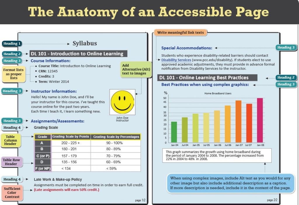
D2L Brightspace Community Website has great resources to offer. This link offers tips on web content accessibility. I am listing some important recommendations below:

  • When possible, use HTML topics to create your course content. D2L provides accessible HTML templates to streamline the content creation process. If you need to use other file formats, such as video files, choose formats that are recognized by most browsers or offer the material in multiple formats.
  • Use a simple layout that does not use tables or columns to organize information. When information is organized simply, it is easier for students to read and understand. Simple layout is also easier for assistive technology devices to interpret and present, and for mobile and handheld devices to resize.
  • Do not use color to convey meaning. If you want to show how concepts relate to each other, use a combination of size, color, and text labels.
  • Use headings to communicate the relationships between sections. Use Heading 1 for the title, Heading 2 for major sections, Heading 3 for subsections, and so on. If headings are used correctly, screen reader users can quickly search a page by heading and participants with cognitive disabilities can understand how sections and content relate easier.
  • Make sure each heading, item, and file name are unique.
  • Include alternative text descriptions (alt text) for all graphics. Use double quotes (null) as the alt text if the object is a decorative element that does not add meaning to the topic. If the graphic is a link, begin the alt text with “Link to”. The HTML Editor in Brightspace Learning Environment automatically prompts you to include alt text when you insert an image.
  • Ensure that there is a strong contrast between the text and the background colors in your course materials.
  • If you create PDF files from Microsoft Word or another word processor, format titles and sections using heading so they are correctly tagged in the PDF.
Accessible Page example with different headings and colors

From: https://www.pcc.edu/resources/instructional-support/access/documents/OnlineAccessibilityHandbook-loRes.pdf

June 19

D2L Brightspace Awards Tool: What do you need to know?

Photo credit: www.brightspace.com

With the new D2L update SCSU went through  earlier this month, the Awards tool has been made available. I will summarize the main functionality and features here,but you can always access the full Awards Tool Guide here and a Webinar on the Awards tool.

WHAT IS THE AWARDS TOOL?

The Awards tool can be used to create Badges and Certificates to reflect the achievement of different milestones within a course offering. In the Awards tool, instructors can design badges and certificates and link them to release conditions to allow automatic awarding. Learners can see the awards that they have already earned, as well as those that they have yet to earn, in the associated My Awards tool.

WHY USE THE AWARDS TOOL?

  • Reward learners with badges and certificates immediately after they have completed an activity or assignment.
  • Build an element of gamification into your course and better engage your learners.
  • Provide a consolidation/ celebration piece to the completion of an assignment or activity.
  • Track learner progress and development.
  • Build a hands-off method of instant feedback.
  • Provide learners with certificates that they can share through social media.

CREATING AWARDS

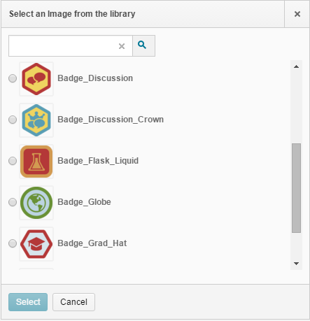
Go to Course Admin and find the Awards tool. Select Create Award to build from scratch. Add a name and description, and select the Award Type (badge or certificate). The award icon image can be selected from the existing images in the Award Icon Library, uploaded from your computer, or created using Badge Designer.

Once your award has been created, you can associate it with release conditions and credits by selecting Edit Properties on the Course Awards page.  Once associated with release conditions, the award will automatically be awarded to all learners who achieve that condition, including those who completed the condition in the past.

D2L Awards five badgesD2L Awards handshake badgeAwards a description of an issued badge

June 12

Choosing the Right Amount of Resources

Emily Berry,  in eLearningLearning reported on a study that shows how people, when presented with more options end up being more discontent with their choice. Psychologically, it seems, when people are presented with more choice they are less likely to choose or be satisfied with their choice.

In teaching, especially online, instructors should be careful when presenting their learners with choices, filling students’ screens with too many features or links. It is better to choose simple, clear actions and instructions ahead of time, so that students do not lose time on figuring out the interface or browsing through many links. Reducing our students’ cognitive load by choosing the right resource for them will improve their learning.

She concludes: “In this fast-paced world, people want bite-sized learning, instantly accessible information which helps them in the ‘now’. Higher numbers and complexity of choices will only take us longer to make decisions and as decision time increases, the user experience suffers.”

Three students sitting with one looking at his lap top


June 8

D2L Visual Design Change to Daylight Experience

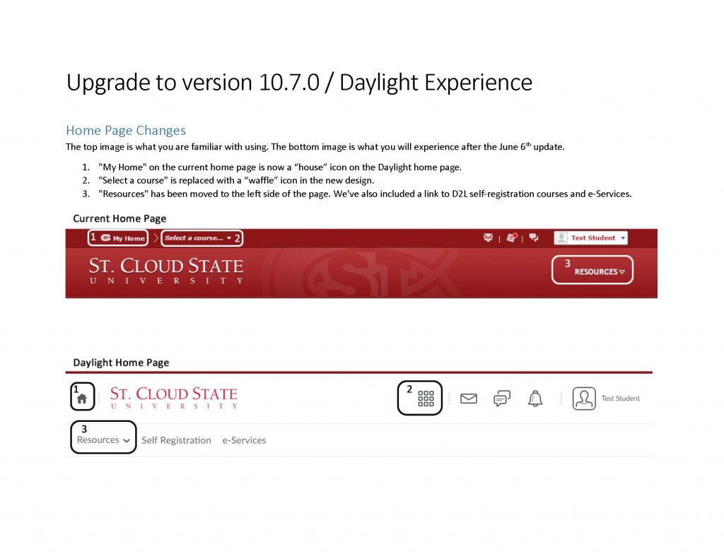
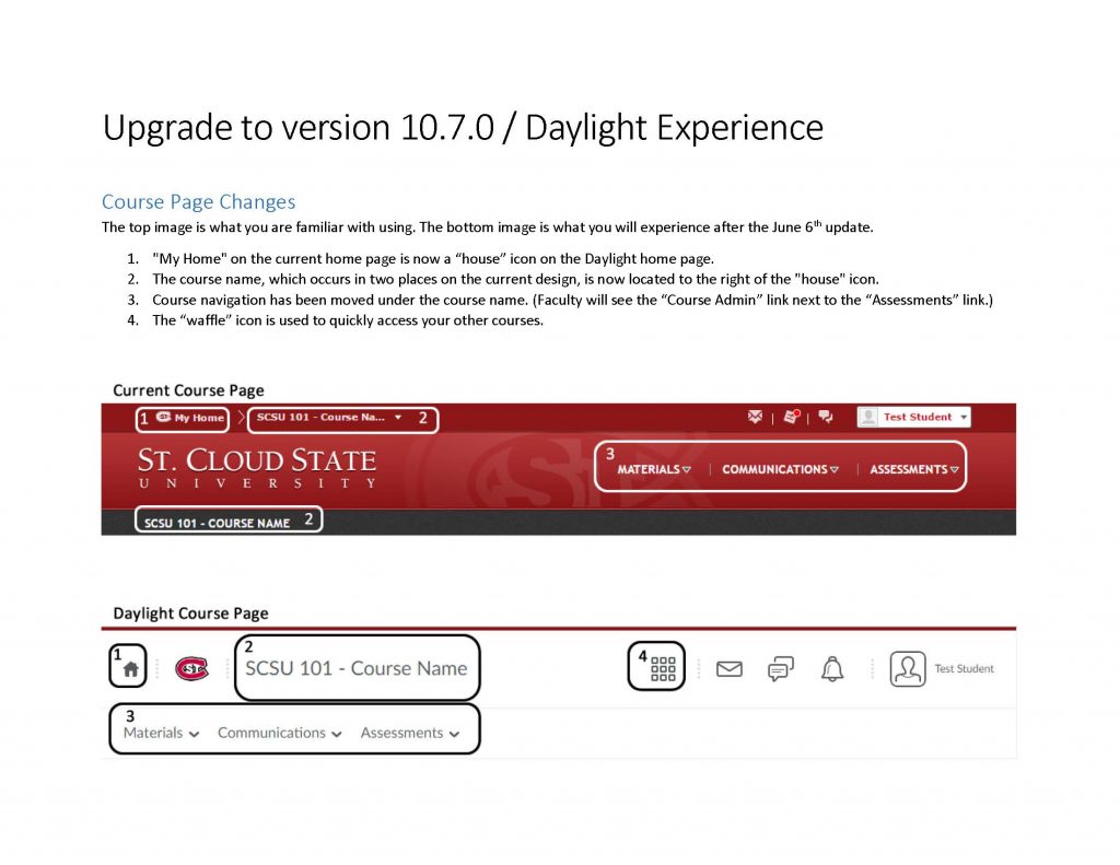
As we have previously announced, D2L update brought a visual design change that is much more responsive – works the same on different devices and matches our students’ needs. Below you will find a quick overview of “before and after”, so you can easily navigate the new design right away. The text describes the circled areas on the D2L homepage and course page.D2L Dayligh Visual Design Changes

D2L Dayligh Visual Design Changes