June
20
Meeting Web Content Accessibility Standards
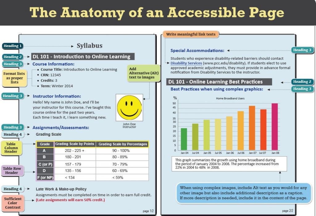
D2L Brightspace Community Website has great resources to offer. This link offers tips on web content accessibility. I am listing some important recommendations below:
- When possible, use HTML topics to create your course content. D2L provides accessible HTML templates to streamline the content creation process. If you need to use other file formats, such as video files, choose formats that are recognized by most browsers or offer the material in multiple formats.
- Use a simple layout that does not use tables or columns to organize information. When information is organized simply, it is easier for students to read and understand. Simple layout is also easier for assistive technology devices to interpret and present, and for mobile and handheld devices to resize.
- Do not use color to convey meaning. If you want to show how concepts relate to each other, use a combination of size, color, and text labels.
- Use headings to communicate the relationships between sections. Use Heading 1 for the title, Heading 2 for major sections, Heading 3 for subsections, and so on. If headings are used correctly, screen reader users can quickly search a page by heading and participants with cognitive disabilities can understand how sections and content relate easier.
- Make sure each heading, item, and file name are unique.
- Include alternative text descriptions (alt text) for all graphics. Use double quotes (null) as the alt text if the object is a decorative element that does not add meaning to the topic. If the graphic is a link, begin the alt text with “Link to”. The HTML Editor in Brightspace Learning Environment automatically prompts you to include alt text when you insert an image.
- Ensure that there is a strong contrast between the text and the background colors in your course materials.
- If you create PDF files from Microsoft Word or another word processor, format titles and sections using heading so they are correctly tagged in the PDF.

